Class 12 Data Science
Exploratory Data Analysis:

Exploratory Data Analysis is the process of carrying out an initial analysis of the available data to find out more about the data. We usually try to find patterns, try to spot anomalies, and test any hypotheses or assumptions that we may have about the data. The process of Exploratory Data Analysis is done with the help of summary statistics and graphical representations.
The main reason for this is that EDA is a way to explore data quickly and find patterns and this can be done best by using graphs.
A Few Types of Exploratory Data Analysis are:
- Univariate Analysis
- Bivariate Analysis.
- Multivariate Analysis.
Univariate Analysis:

Univariate Analysis in statistics refers to the study of data belonging to one category only. “Uni” means one and “variate” means variable hence univariate analysis stands for the statistical study of single-variable data.
There are many techniques available to study single-variable data few of them are as follows
- Find the central value from the given dataset by using concepts like mean, median, and mode. Univariate data can be expressed at a single data point.
- Measure variance and interquartile range about the spread of data.
- Visualize data in form of bar charts, pie charts, and holograms.
Example of univariate data:
- Consider the following data of marks obtained by the students in the subject of computer science. Here single variable under study is marks obtained.

Let’s discuss three common ways of performing univariate analysis with python.
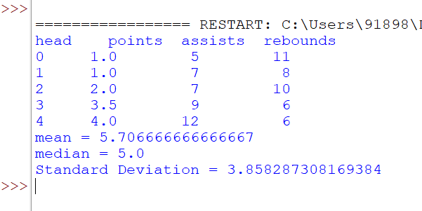
- Find out the center value using mean, median, and mode. Find the spread of data.
- Find out the frequency or occurrence of a particular element.
- Visualization of data using bar charts, Pie charts, and holograms.
Find out the center value using mean, median, and mode. Find the spread of data.
import pandas as pd

#create DataFrame
df = pd.DataFrame({'points': [1, 1, 2, 3.5, 4, 4, 4, 5, 5, 6.5, 7, 7.4, 8, 13, 14.2],
                   'assists': [5, 7, 7, 9, 12, 9, 9, 4, 6, 8, 8, 9, 3, 2, 6],
                   'rebounds': [11, 8, 10, 6, 6, 5, 9, 12, 6, 6, 7, 8, 7, 9, 15]})

#view first five rows of DataFrame
print("head",df.head())

#calculate mean of 'points'
print("mean =",df['points'].mean())

#calculate median of 'points'
print("median =",df['points'].median())

#calculate standard deviation of 'points'
print("Standard Deviation =",df['points'].std())
output:
Find out the frequency or occurrence of a particular element.
import pandas as pd

#create DataFrame
df = pd.DataFrame({'points': [1, 1, 2, 3.5, 4, 4, 4, 5, 5, 6.5, 7, 7.4, 8, 13, 14.2],
                   'assists': [5, 7, 7, 9, 12, 9, 9, 4, 6, 8, 8, 9, 3, 2, 6],
                   'rebounds': [11, 8, 10, 6, 6, 5, 9, 12, 6, 6, 7, 8, 7, 9, 15]})

print(df["points"].value_counts())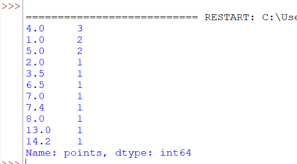
Visualization of data using bar charts, Pie charts, and holograms.
import pandas as pd
import matplotlib.pyplot as plt
#create DataFrame
df = pd.DataFrame({'points': [1, 1, 2, 3.5, 4, 4, 4, 5, 5, 6.5, 7, 7.4, 8, 13, 14.2],
 'assists': [5, 7, 7, 9, 12, 9, 9, 4, 6, 8, 8, 9, 3, 2, 6],
 'rebounds': [11, 8, 10, 6, 6, 5, 9, 12, 6, 6, 7, 8, 7, 9, 15]})
print(df["points"].value_counts())
df.hist(column='points', grid=False, edgecolor='black')
plt.show()
Bivariate Analysis:
Bivariate analysis is analyzing the relationship between two variables.
The different methods used to analyze bivariate data are as follows
- Scatterplots
- Correlation Coefficients
- Simple Linear Regression
Example 1: ( Ice Cream Business )
The ice cream business often uses bivariate data about temperature and total sales of ice cream. As temperature increases, ice cream sales also tend to increase. Let us understand this with the below table.

This is an example of bivariate analysis since it uses only two variables temperature and ice cream sales.
- Scatterplots display the relationship between two variables temperature and ice cream sales.
import matplotlib.pyplot as plt

x = [20,25,30,35,40]
y = [1000,1200,1400,1500,1800]
plt.xlabel("ice cream")
plt.ylabel("Sales")
plt.scatter(x, y)
plt.show()
Output:

2. Correlation Coefficients
import numpy as np

x = [20,25,30,35,40]
y = [1000,1200,1400,1500,1800]
r=np.corrcoef(x,y)
print(r)
Output:

corrcoef() returns the correlation matrix, which is a two-dimensional array with the correlation coefficients. Here’s a simplified version of the correlation matrix you just created:
      x        y
x    1.00    0.99
y    0.99    1.00
The diagonal of the matrix is always 1.
The left upper is the correlation coefficient of x and x.
The right lower is the correlation coefficient of y and y.
These values are equal and both represent the Pearson correlation coefficient for x and y. In this case, it’s approximately 0.99